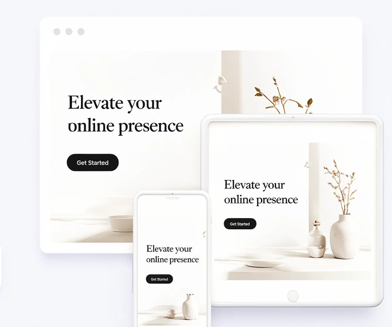
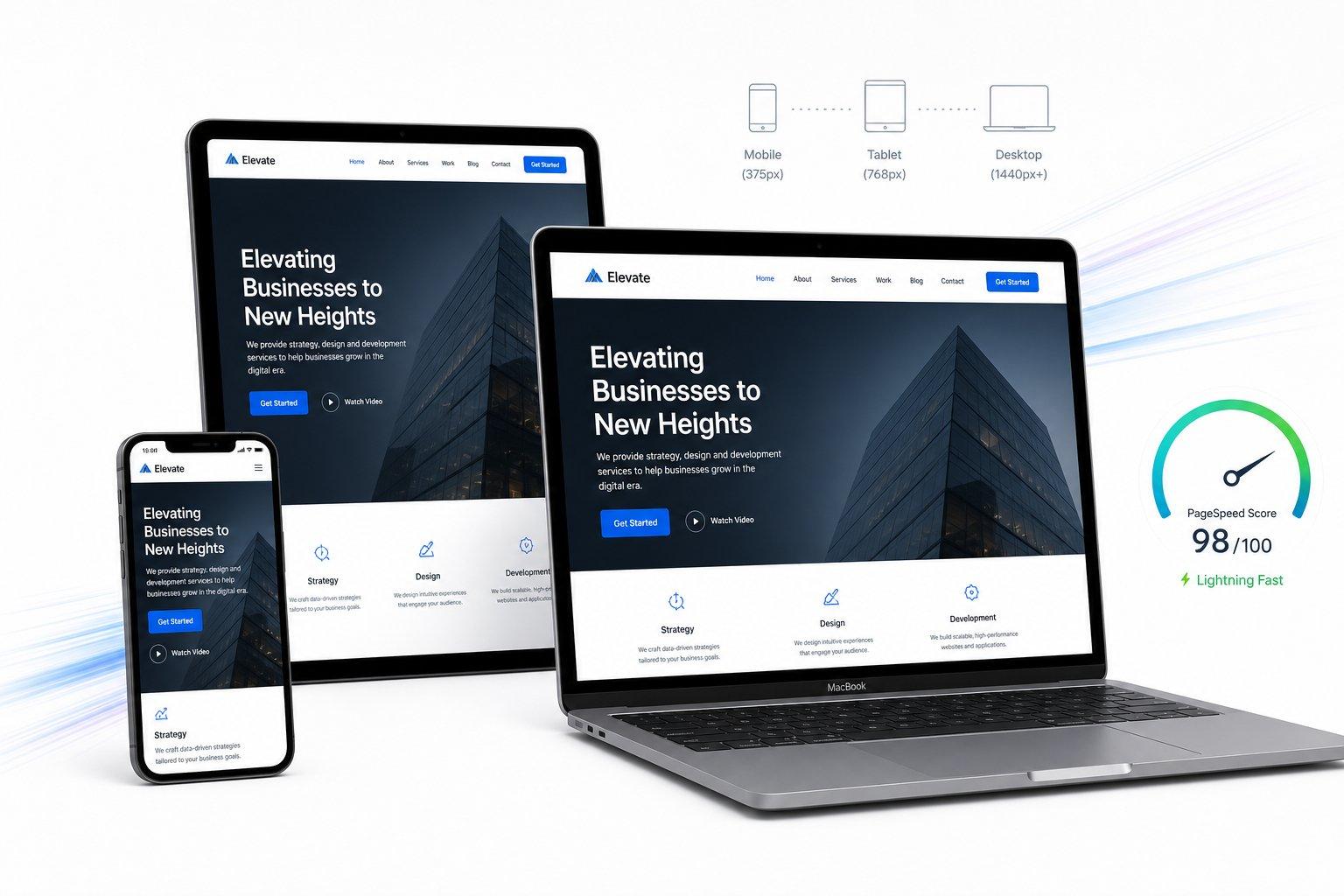

You spend hours perfecting your website on a wide desktop monitor, open the exact same link on your phone while standing in line, and suddenly find tiny links crowded together, a giant image hogging the entire screen, and a contact form that feels like a puzzle to tap.
"My desktop website looks great, so why does the mobile version feel like an afterthought—and how do I stop losing phone visitors right when they try to reach me?"
Here is the plain truth:
Shrinking a wide desktop layout onto a narrow phone screen does not create a good mobile experience; it just squeezes elements until reading and tapping become frustrating. Real mobile design reshapes how information is ordered, spaced, and interacted with on a handheld screen. Today we are walking through mobile website design from top to bottom—so you will discover how to apply mobile-first design, shape mobile-friendly website design, and turn phone visitors into real inquiries without awkward workarounds.
We know how often builders struggle with that nagging worry—wondering whether a page will actually adapt smoothly for every phone visitor across different screen sizes. When you build with BoltWeb, its drag-and-drop visual editor lets you describe what you want and arrange blocks as you go while mobile-responsive structure works behind the scenes, no coding knowledge required. Inside BoltWeb, AI Foundry helps you lay out clear, responsive sections quickly so you can focus on serving customers while still verifying finished pages across real phones.
Let's dive into the practical choices that make a website genuinely comfortable to use on a phone.

1. Design Your Website Around the Way People Actually Use Their Phones
"My desktop website looks great, but the mobile version feels like an afterthought."
People using a phone rarely sit back with a mouse and a wide canvas—they scroll with one thumb, skim quickly between tasks, search for specific answers, compare details on the move, and tap to call, book, or message right away. Treating mobile as a smaller copy of desktop ignores how narrow screens and touch habits change what works.
Focusing on mobile website design and mobile-first design shifts the page around real phone habits so mobile-friendly website design supports every step of a visitor's journey.
2. Choose a Mobile Layout That Fits Small Screens Without Hiding Important Content
Trying to cram multi-column desktop grids into a narrow phone screen either crushes text into thin strips or forces awkward side-to-side squeezing. Instead, responsive layouts use flexible containers, thoughtful breakpoints, natural vertical stacking, and clean spacing so each section flows in a clear sequence.
Thoughtful mobile website layout choices make responsive website design far clearer than shrinking desktop blocks, strengthening everyday mobile web design.
3. Make Mobile Navigation Easy to Open, Understand, and Use
When a phone visitor cannot spot your main menu, search option, core services, or contact path within seconds, they back out to a competitor. Keep menu labels unmistakable, avoid deep nested submenus that hide key pages, keep sticky headers compact, and surface high-intent actions clearly.

A bottom navigation bar can help when an app-like experience has a few primary destinations, whereas a cluttered bottom bar can crowd compact web pages—so clean mobile navigation design, an intuitive mobile menu, and straightforward mobile website navigation always win on clarity (and pair well with a clear internal linking strategy for small business).
4. Put the Most Important Information Where Visitors See It First
Phone screens vary in height and browser chrome, so you should never assume every visitor sees the exact same pixel slice—yet what appears near the top still sets immediate expectations. Lead with a plain headline, a concrete explanation of who you help and how, and a clear next action before pushing visitors through long background stories.
Ordering your mobile content hierarchy deliberately improves mobile website layout flow and sharpens mobile homepage design right from the first screen.
5. Use Readable Text Sizes and Comfortable Spacing on Phone Screens
Tiny text forces visitors to pinch and zoom, while giant display headings that swallow half a phone screen push real explanations out of sight. Pair legible body text (16px or larger is a practical starting point), balanced heading scale, open line height, comfortable paragraph margins, and sensible line widths so reading feels calm rather than cramped.
Refining mobile typography and mobile website fonts directly boosts mobile readability on real handsets (see web.dev: Responsive Web Design Basics for core responsive layout principles and our guide to improve website readability).
Build High-Converting Mobile Pages Faster With BoltWeb
Shape Responsive Layouts Visually Without Wrestling Code
Do not let clunky mobile layouts or scattered page edits hold back buyers who are ready to reach out from their phones. Build and customize mobile-friendly pages on BoltWeb with AI Foundry, link your core pages cleanly, and grow your business online with confidence.
Get Started On Your Journey →6. Make Buttons and Touch Targets Comfortable to Tap
Fingers need roomier targets and wider gaps than a mouse pointer—especially when a visitor is walking or holding a phone one-handed. Keep tap areas comfortable (with WCAG 2.2 setting a 24 × 24 CSS pixel baseline under relevant rules and 44 × 44 CSS pixels offering a stronger enhanced target), separate nearby links and buttons so accidental taps drop, and make primary actions stand out clearly.
Strong mobile buttons, generous touch target size, attentive mobile UX design, and practical mobile-friendly website design keep people from tapping the wrong link by mistake (see W3C: Understanding Target Size (Minimum) and our guide to design mobile-friendly website buttons).
7. Design Mobile Forms That People Can Complete Without Frustration
Typing long forms on a small glass keyboard gets tedious fast—especially when labels vanish inside placeholders, the wrong keyboard pops up, or a vague error wipes out what someone just typed. Keep forms short, use proper input types (tel, email, url), enable autofill where helpful, space fields comfortably, show clear validation feedback near the field, and break longer requests into clear steps when needed.
Thoughtful mobile form design makes mobile-friendly forms and every mobile contact form much easier to finish on a phone (see MDN: HTML Input Types for input attributes and field behavior).
8. Choose Images and Videos That Fit the Mobile Experience
A wide landscape banner or tall hero image that looks dramatic on a desktop monitor can push your headline, value summary, and call to action completely off a phone screen or slice off the main subject when cropped automatically. Choose mobile-friendly framing and focal points, keep media proportions balanced on narrow viewports, and ensure videos fit cleanly without taking over the entire screen before visitors read what you offer.
Smart mobile website images, responsive image crops, and sensible mobile video design preserve visual quality without crowding out your message (and pair well with our guide to optimize website images for SEO).

9. Give Mobile Visitors Clear Calls to Action Without Overloading the Page
A helpful call to action meets visitors right where a decision makes sense—such as right after explaining a service, listing pricing or booking details, or offering a direct tap-to-call or message option. Repeating identical urgent buttons every few lines or stacking competing calls to action side by side creates noise instead of clarity.
Pairing one clear primary action with a low-friction secondary option strengthens mobile call to action clarity, supports mobile conversion design, and keeps mobile website buttons focused on helping visitors take the next step.
10. Remove Mobile Design Problems That Make Pages Difficult to Use
Small layout slips multiply on narrow screens—turning a promising page into an obstacle course when horizontal scrolling appears, text clips or overlaps, a viewport tag is missing, popups block core text, oversized sticky bars crowd the screen, cards look cramped, or hover-only menus fail on touchscreens. Checking both portrait and landscape views catches layout shifts and awkward alignment before real visitors run into them (see MDN: Viewport Meta Tag and our guides to fix Cumulative Layout Shift and check website accessibility).
Eliminating mobile website design mistakes prevents mobile layout problems and keeps responsive design issues from costing you leads.
11. Test Your Mobile Website Design on Different Devices and Screen Sizes
A single screenshot on one phone or a quick desktop window resize does not tell you how your layout behaves across different screen widths, portrait and landscape rotations, browsers, and real visitor tasks. Design testing focuses on usability—whether menus open cleanly, text reads comfortably, buttons tap accurately, and forms submit smoothly—distinct from deep speed and script profiling (see our guide to test mobile website performance when you also want performance diagnostics).
Regular mobile website testing helps you test responsive design across real screens and protect mobile website compatibility for every visitor.
12. Build and Publish Mobile-Friendly Pages with a Repeatable Design Checklist
Mobile quality holds up best when you plan layout order, typography, spacing, tap targets, forms, media framing, and device checks as part of building every page—not as a last-minute patch after launch. When you build and manage pages with BoltWeb, its visual editor and mobile-responsive foundation help you create clean pages quickly, while your own review and real-phone testing keep every finished page dependable before going live.
Following a consistent mobile website design checklist keeps every mobile-friendly website sharp on the BoltWeb website builder long after launch day.
Turn Every Phone Glance Into a Confident Tap
Picture a prospective buyer opening your service page mid-commute on a phone screen, spotting your offer right away, tapping a roomy button without a single mis-hit, and sending a clear inquiry before they ever put their phone down.
Get Started On Your Journey →FAQs: Mobile Website Design Best Practices
1. My desktop website looks polished on a wide monitor, so why does the phone version feel like a cramped afterthought?
Shrinking a desktop layout onto a narrow phone screen does not create a smooth mobile experience—it squeezes elements until reading and tapping get frustrating. Real phone visitors scroll with one thumb, skim between tasks, and expect pages shaped around handheld screens rather than reduced PC views.
Focusing on mobile website design and mobile-first design reshapes the experience from the ground up so mobile-friendly website design supports how people actually browse on phones.
2. How do I fit everything a visitor needs on a phone screen without making the layout feel crowded?
Cramming side-by-side desktop columns into a narrow viewport crushes text or forces awkward horizontal squeezing. Responsive containers, clean breakpoints, natural vertical stacking, and open spacing let information flow in a logical sequence that feels calm rather than packed.
Thoughtful mobile website layout choices make responsive website design clearer than shrinking desktop blocks, strengthening everyday mobile web design.
3. Visitors shouldn't have to hunt around just to find my services or contact info—how should I set up mobile navigation?
If someone on a phone cannot spot your menu, search option, core services, or contact path quickly, they back out before ever seeing what you offer. Keep labels clear, avoid deep nested menus that hide important pages, keep sticky headers compact, and surface key actions cleanly—using a bottom bar only when a few primary destinations truly fit without crowding the page.
Clean mobile navigation design, an intuitive mobile menu, and straightforward mobile website navigation keep visitors moving without getting lost (and pair naturally with a focused internal linking strategy for small business).
4. How do I help visitors grasp what my business offers right away without forcing them to scroll through everything?
Screen heights and browser bars vary across phones, so you cannot rely on one exact pixel slice—yet what appears near the top still sets immediate expectations. Lead with a plain headline, a concrete summary of who you help and how, and a clear next step before long background details.
Intentional mobile content hierarchy strengthens mobile website layout flow and sharpens mobile homepage design from the moment a page opens.
5. Why does reading on my phone feel tiring even when my copy itself is straightforward?
Tiny text forces constant pinching and zooming, while oversized display headings that swallow half a phone screen push real explanations out of sight. Comfortable body text size, balanced heading scale, open line height, clean paragraph margins, and readable line lengths keep text easy on the eyes.
Refining mobile typography and mobile website fonts directly improves mobile readability on real phones (see web.dev: Responsive Web Design Basics and our guide to improve website readability).
6. People keep missing buttons or tapping the wrong link on mobile—how do I fix that?
Thumbs cover far more area than a mouse cursor, especially when someone is walking or holding a phone one-handed. Roomy tap targets (with WCAG 2.2 setting a 24 × 24 CSS pixel baseline under relevant provisions and 44 × 44 CSS pixels providing a stronger enhanced target), clean spacing between adjacent links or buttons, and distinct primary styling stop accidental mis-taps.
Strong mobile buttons, generous touch target size, attentive mobile UX design, and practical mobile-friendly website design make tapping reliable (see W3C: Understanding Target Size (Minimum) and our guide to design mobile-friendly website buttons).
7. Visitors start filling out my mobile contact form and drop off before finishing—what usually goes wrong?
Typing on a small touchscreen gets tedious fast when labels disappear inside placeholders, the wrong keyboard opens, or an unclear error forces someone to start over. Short forms, matching input types (tel, email), helpful autofill, comfortable spacing between fields, clear validation cues, and step-by-step grouping when needed make completion much easier.
Thoughtful mobile form design helps mobile-friendly forms and every mobile contact form get finished on a phone (see MDN: HTML Input Types).
8. My desktop photos look sharp on a big screen, but on a phone they take over the entire display—what should I do?
A wide banner or tall image that looks great on a desktop monitor can push your offer and call to action off a phone screen or crop out the key subject on narrow viewports. Adjust framing and focal points for mobile proportions, keep media balanced against surrounding text, and make sure videos do not overwhelm the screen before visitors read what you provide.
Smart mobile website images, responsive crops, and sensible mobile video design keep visuals helpful without crowding out your message (and pair cleanly with our guide to optimize website images for SEO).
9. How do I encourage visitors to call, book, or message on mobile without making the page feel pushy?
Place calls to action right where a decision naturally forms—such as right after explaining a service, sharing pricing or booking details, or offering a direct tap-to-call or inquiry option. Repeating identical urgent buttons every few lines or stacking competing actions side by side creates clutter instead of clarity.
Clear mobile call to action placement, focused mobile conversion design, and well-spaced mobile website buttons guide visitors toward one clear next step without pressure.
10. Why do some sections break or get frustrating when I open them on a phone?
Small layout flaws multiply on narrow screens—turning a helpful page into a headache when horizontal scrolling creeps in, text clips or overlaps, a viewport tag is missing, popups cover core content, sticky bars crowd the view, cards look cramped, or hover-only menus fail on touchscreens. Checking both portrait and landscape orientations catches layout shifts and awkward alignment early (see MDN: Viewport Meta Tag and our guides to fix Cumulative Layout Shift and check website accessibility).
Catching mobile website design mistakes prevents mobile layout problems and keeps responsive design issues from costing you inquiries.
11. How can I be confident my mobile design works across different phones and screen sizes—not just my own?
One screenshot on one phone or a quick desktop window resize does not reveal how layouts hold up across varying screen widths, portrait and landscape rotations, browsers, and real visitor tasks. Design testing checks usability—whether menus open cleanly, copy reads comfortably, buttons tap accurately, and forms submit smoothly—separate from deeper speed diagnostics (see our guide to test mobile website performance).
Regular mobile website testing helps you test responsive design across real screens and protect mobile website compatibility for every visitor.
12. How can I build mobile-friendly pages easily and keep every new page consistent before publishing?
When you want a faster visual way to arrange responsive sections, place mobile-friendly buttons, and keep new pages consistent without coding from scratch, BoltWeb and AI Foundry inside BoltWeb let you build and adjust pages visually while mobile-responsive structure works behind the scenes—while your own real-phone review ensures every finished page is ready before going live.
Following a consistent mobile website design checklist keeps every mobile-friendly website sharp on the BoltWeb website builder long after launch day.
Picture a potential customer opening your page mid-commute on a phone screen, spotting your offer at a glance, tapping a roomy button with one thumb, and sending an inquiry before they ever put their phone down.