
You spend hours putting every detail about your service onto a page, hit publish feeling proud of how thorough it is, and then watch visitors bounce in seconds without ever reaching your contact form.
"I have genuinely useful information on my website, so why do people skim right past it or leave before reading what I wrote?"
Here is the plain truth:
Having the right facts on a page is not the same thing as making those facts easy to absorb. When visitors hit walls of dense text, tangled sentences, cramped line spacing, or vague headings, their eyes tire out before their curiosity pays off. Today we are walking through how you can improve website readability across your copy, typography, spacing, and mobile layouts—so you will discover how to turn overwhelming blocks of text into clear, welcoming pages people actually read.
In the past, tightening readability meant jumping between separate text editors, counting sentence lengths by hand, and guessing whether your spacing felt cramped on smaller screens. Using BoltWeb when you build your website gives you practical tools after building that help make your site's readability much better—we know how hard it is to improve readability, check wording, and group ideas cleanly, and BoltWeb with AI Foundry gives you strong layout and content controls so your pages read effortlessly while you still verify every finished page before sharing it.
Let's break down the practical edits that make visitors stay and read.
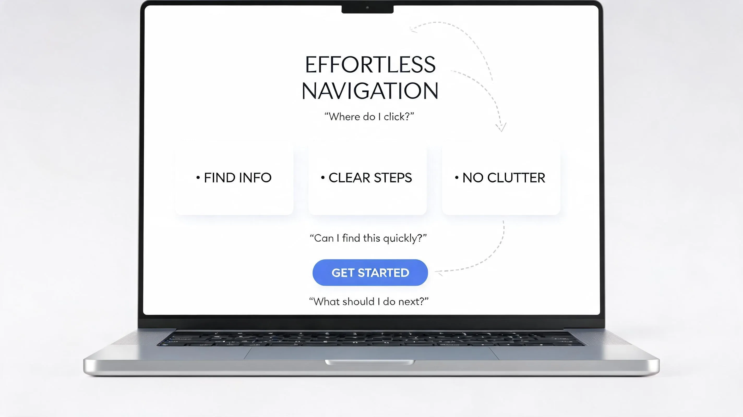
1. Why Do Visitors Leave When Your Website Has the Information They Need?
A page can pass every single grammar check and still feel exhausting to read. When a visitor lands on your site, they are rarely settling in with a cup of coffee to study every paragraph from top to bottom—they are scanning for proof that you understand their problem and can solve it quickly.
Dense walls of text, vague phrasing, flat visual hierarchy, and confusing page flow force people to burn mental energy just figuring out what you offer. Readability is completely different from basic grammar: grammar ensures sentences follow language rules, while readability determines whether a real human can absorb your message without squinting, re-reading, or giving up. Focusing on website content readability helps you improve website readability and transform a crowded draft into a genuinely readable website that holds attention.
2. Find the Sentences That Make Your Website Content Difficult to Understand
The fastest way to spot tangled writing is to read your draft out loud and notice where you run out of breath or stumble over phrasing. Sentences become hard to follow when they pack three separate ideas into one clause, rely on passive constructions that hide who is doing what, lean on unnecessary technical terms, or pad simple points with vague corporate filler.
Tightening sentence structure keeps clear website writing front and center so you improve content readability without stripping away real substance.
3. Break Long Paragraphs into Smaller Sections People Can Follow
When visitors see a ten-line paragraph on a screen, their brain registers a chore before they even read the first word. Organizing each paragraph around one clear main idea lets you split oversized blocks naturally at the exact moment your thought shifts to a new step, reason, or example.
To keep shorter blocks from feeling choppy or disconnected, link them with natural transitions that carry the reader forward from one point to the next rather than dropping isolated one-liners without context. Disciplined paragraph length and clean website content formatting help you improve website readability while making every action item stand out clearly.
4. Choose Website Fonts That Stay Readable on Different Screens
Typography sets the physical comfort of your entire page before a visitor finishes the opening sentence. Expressive display fonts, condensed typefaces, or stylized scripts can bring strong visual personality to a short hero headline, yet those exact same fonts become tiring and hard to decode when stretched across full paragraphs of body text.
For body copy, choose a clean, balanced typeface with regular weight (400), comfortable base font size (typically 16px to 18px on standard screens), and natural letter spacing so letterforms stay distinct at a glance. Pairing distinctive headings with calm, neutral body text gives you the best of both worlds—so readable website fonts, refined website typography, and sensible website font size support comprehension across laptops, tablets, and phones.
5. Give Your Text Enough Space with Better Line Height and Content Width
Even straightforward writing feels exhausting when lines crowd into each other vertically or stretch endlessly from one edge of a widescreen monitor to the other. When lines pack too tightly, eyes accidentally re-read the same line; when columns run too wide, eyes lose their place jumping back to the left margin.
Setting body line height around 1.5 to 1.7, leaving clear spacing between paragraphs, keeping body copy left-aligned for predictable eye tracking, and capping text column width around 60 to 75 characters creates immediate visual relief. Adjusting website line height, text spacing, and content width transforms a cramped page into a genuinely readable website layout.
Turn Clear Copy Into Higher Conversions With BoltWeb
Structure Readable Pages Fast Without Fighting Layout Setup
Do not let dense blocks, awkward column widths, or clunky formatting hide your best offers from visitors who are ready to reach out. Build and refine clean, easy-to-scan pages on BoltWeb with AI Foundry, group ideas smoothly, connect related guides naturally, and scale your site without wrestling raw code.
Get Started On Your Journey →6. Use Clear Headings So Visitors Can Find the Information They Want
Think of headings as signposts that help busy visitors decide where to spend their attention. Most readers scan down the page looking at H2 and H3 headings first—and if those labels are vague placeholders, people assume your page lacks the answer they need and leave.
Strong headings follow a logical hierarchy (H1 for the main page topic, H2 for primary sections, H3 for supporting points) and state a concrete benefit, question, or outcome rather than a generic topic label. Descriptive website heading structure, clear readable content headings, and intentional content organization guide visitors straight to what matters most (and connect naturally with a clean internal linking strategy for small business).
7. Replace Complicated Words with Language Your Visitors Already Understand
Many business owners reach for inflated marketing phrases, unexplained acronyms, or heavy industry jargon because they worry plain words sound too casual. In reality, real authority comes from explaining complex ideas in language your customer already uses when describing their problem.
You never have to dumb down technical accuracy to write clearly—simply swap abstract nouns for active verbs, spell out unfamiliar abbreviations on first use, and explain specialized terms in plain English right where they appear. Choosing simple website language and clear website content helps you improve content readability while building trust fast (see Google Search Central: Creating Helpful, Reliable, People-First Content for why people-first clarity supports organic performance).
8. Make Text Easier to Read with Better Color Contrast and Backgrounds
A soft gray caption over a cream background or thin white text layered directly across a bright hero photograph might look artistic in a design mockup, yet turn nearly unreadable on a phone screen in midday sunlight. Eye strain happens quickly whenever text blends into the surface behind it.
Follow sensible WCAG contrast benchmarks—aiming for at least 4.5:1 contrast between normal body text and its background (3:1 for large headings)—and place body copy over solid, uncluttered backgrounds or darkened image overlays rather than busy textures. Strong website text contrast, intentional readable website colors, and high text readability keep every word effortless to read (and align directly with how you check website accessibility).
9. Use Lists, Bold Text, and Short Examples to Explain Important Information
Formatting choices act like visual anchors that help readers compare options, follow sequential instructions, and remember key takeaways without re-reading whole sections. Use numbered steps when order matters, concise bullet points for related features, compact tables for side-by-side comparisons, and short callouts or examples to ground abstract advice in reality.
At the same time, restraint keeps formatting effective: never bold entire paragraphs—which cancels out emphasis—and avoid turning every single sentence into a separate list item when flowing prose explains the connection better. Thoughtful website content formatting creates readable website content and genuinely scannable content without visual clutter.
10. Check Whether Your Website Is Easy to Read on a Phone
A layout that looks airy and balanced on a fifteen-inch laptop screen can feel cramped and overwhelming on a phone held in one hand. Narrow screen widths double or triple paragraph line counts, shrink headings relative to body copy, and push calls to action far below the fold if spacing is not tuned for mobile viewports.
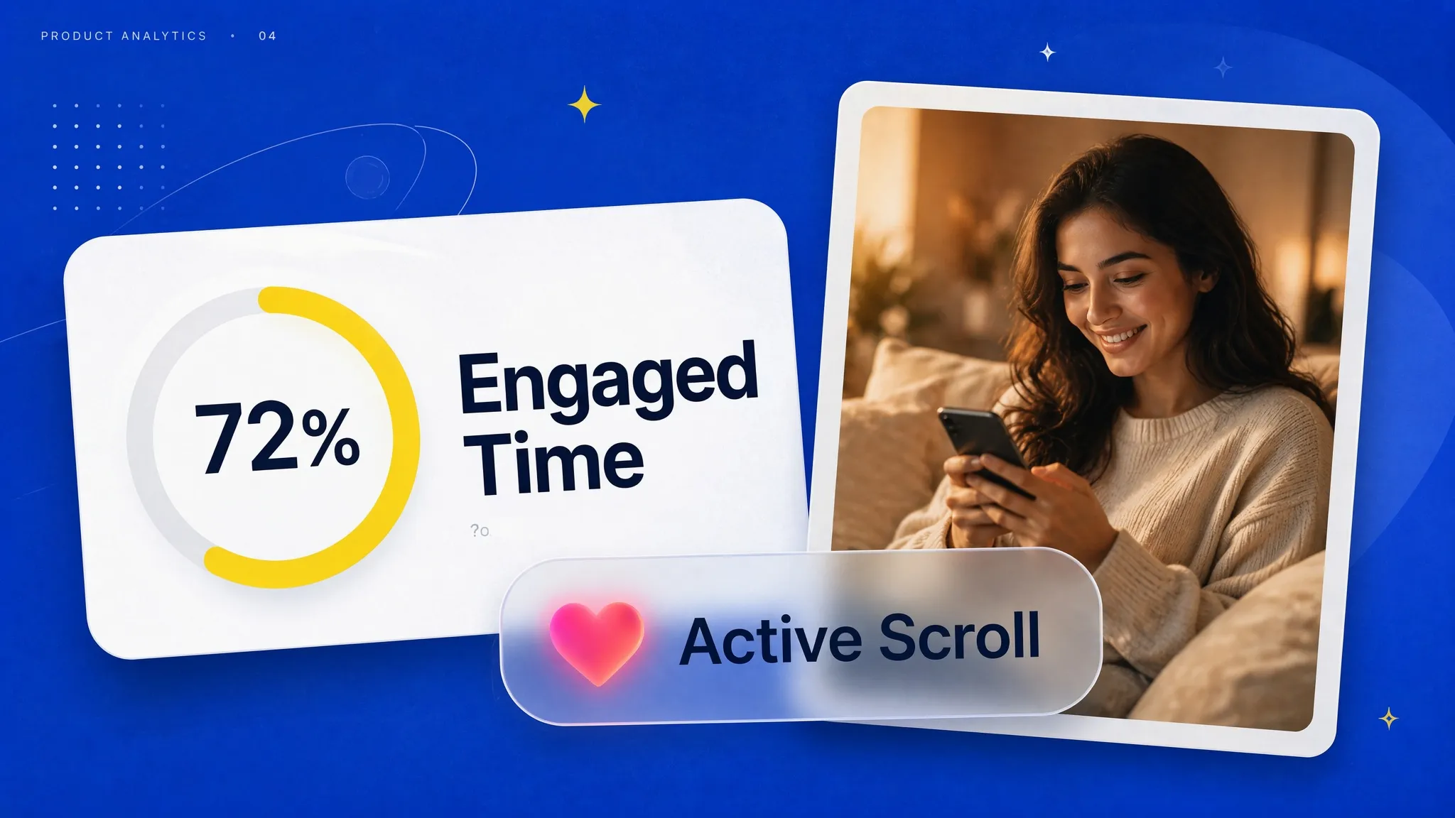
Always open your finished pages on an actual smartphone—not only a desktop preview—to verify that body text stays legible without pinching to zoom, headings maintain clear hierarchy, and paragraphs break naturally on narrow screens. Checking mobile readability, mobile website text, and responsive typography protects mobile visitors (alongside our guides to test mobile website performance and design mobile-friendly website buttons).
11. Use Readability Checkers to Find Content That Needs Editing
Automated readability tools give you an objective second pair of eyes when you have stared at your own draft for too long. Formulas like Flesch Reading Ease (where higher scores indicate easier reading) and Flesch-Kincaid Grade Level flag overly long sentences, dense syllables, and passive phrasing so you know exactly which paragraphs deserve a closer edit.

| Tool | What Readers Can Use It For |
|---|---|
| Hemingway Editor | Highlight difficult sentences, complex wording, and passive voice. |
| Grammarly | Review grammar, sentence clarity, and wording suggestions. |
| Readable | Examine readability scores and text complexity. |
| Microsoft Word | Review readability statistics when the relevant checking options are enabled. |
| Google Docs | Edit and review website copy before publishing. |
Remember that each tool evaluates different dimensions of writing—from grammar mechanics to sentence length—and a readability score is a diagnostic clue rather than proof that your copy resonates with your specific audience. Pairing a readability checker, website readability score, Flesch Reading Ease, and a quick readability test with human judgment delivers the strongest edits (and aligns with Google Search Central: SEO Starter Guide content clarity).
12. Create a Website Readability Checklist for Every New Page
Readability improves permanently when you treat it as a standard pre-publish step rather than an occasional emergency rewrite after visitors stop converting. When you build with BoltWeb, its post-build editing and layout tools make it far easier to structure sections, group related wording cleanly, and refine spacing—while running through a quick final review ensures every finished page reads clearly before you share it.
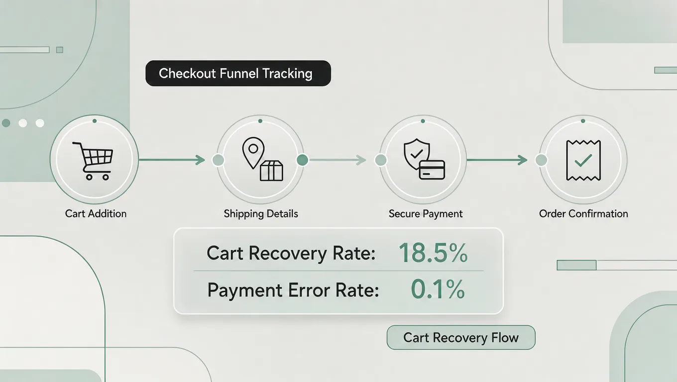
Working through a repeatable website readability checklist drives steady website content improvement so you improve website readability on every page you publish.
Let Your Best Ideas Speak Clearly Before Visitors Scroll Away
Picture a prospective customer opening your service page on their phone, gliding effortlessly from clear heading to crisp explanation without squinting, re-reading a tangled sentence, or wading through walls of text, and reaching out right away because your value made sense on the very first read.
Get Started On Your Journey →FAQs: Improve Website Readability
1. I spent hours putting solid facts on my service page, so why do visitors bounce after two seconds without reading a single line?
Having helpful information on a page is only half the job—if visitors have to fight dense paragraphs, muddy phrasing, flat layout cues, or confusing menus just to find your point, their eyes give up before their curiosity can turn into a lead.
Good grammar only checks language rules; true readability lowers mental effort so real people absorb your offer effortlessly. Focusing on website content readability helps you improve website readability and turn a crowded draft into a genuinely readable website that holds onto visitors.
2. How do I spot the exact sentences on my page that trip people up?
Read your draft out loud and listen for places where you run out of breath or stumble over phrasing. Sentences usually bog readers down when they cram three ideas into one breath, hide behind passive wording, rely on unexplained technical terms, or pad a simple point with corporate filler.
Cutting unnecessary weight and tightening sentence structure supports clear website writing so you improve content readability without losing a shred of useful detail.
3. My paragraphs look like huge walls of text—how should I break them up without making the page feel choppy?
Give each paragraph one clear job and start a fresh paragraph whenever your focus shifts to a new step, reason, or example.
To keep shorter paragraphs flowing smoothly rather than feeling abrupt, connect ideas with natural transitions that carry the reader forward from one thought to the next. Smart paragraph length and clean website content formatting help you improve website readability while keeping your explanation easy to follow.
4. My website looks stylish on screen, but is the font actually comfortable to read?
Decorative display or script fonts can add flair to a short headline, yet they tire eyes quickly when stretched across full paragraphs of body copy.
Pairing a calm, legible body font with comfortable font size, steady weight, and natural letter spacing gives your page character without hurting comfort. Choosing readable website fonts, refined website typography, and sensible website font size keeps reading smooth across laptops and phones alike.
5. Why does reading my page feel tiring even when the words themselves are simple?
Even plain words feel exhausting when lines sit too close together vertically or stretch endlessly across a wide monitor so eyes lose their place scanning back to the left edge.
Opening up website line height, adding clear space between paragraphs, keeping body copy left-aligned, and holding line lengths to a comfortable column width brings immediate relief. Tuning website line height, text spacing, and content width creates a genuinely readable website layout.
6. Most people skim instead of reading every word—how do I help them find what they need fast?
Busy visitors scan headings first to decide where to spend their time, so vague labels like "More Details" or "Additional Information" force them to guess what is inside.
Clear headings follow a logical hierarchy and state a concrete benefit, answer, or topic so readers can jump straight to the section that matches their need. Strong website heading structure, descriptive readable content headings, and clean content organization guide scrollers straight to your value (and pair naturally with a focused internal linking strategy for small business).
7. How do I sound credible and professional without burying buyers in complicated jargon?
Real authority comes from making complex ideas easy to grasp, not hiding behind inflated buzzwords, unexplained acronyms, or insider terminology that makes customers feel out of the loop.
You never have to sacrifice accuracy to speak plainly—simply swap stiff abstractions for clear verbs and explain specialized terms in everyday language right where they appear. Using simple website language and clear website content helps you improve content readability while building trust faster (see Google Search Central: Creating Helpful, Reliable, People-First Content).
8. My colors look great in a mockup, so why is some text hard to read on real screens?
Pale text over a soft background or thin lettering dropped over a busy photograph can look fine on a calibrated monitor in a dim room, yet become hard to read in bright daylight or on lower-contrast displays.
Keeping contrast clear between text and background—and placing body copy over clean, uncluttered surfaces rather than noisy visuals—protects website text contrast, readable website colors, and everyday text readability (and aligns closely with how you check website accessibility).
9. How can I make key takeaways stand out without turning the whole page into clutter?
Use numbered steps for sequences, concise bullet points for related items, compact tables for side-by-side comparisons, and short examples to ground advice in real situations.
Avoid bolding entire paragraphs—which makes everything shout at once—and avoid turning every sentence into a separate list item when smooth prose explains the connection better. Thoughtful website content formatting delivers readable website content and truly scannable content without visual noise.
10. My text reads fine on my laptop, but what happens when someone opens it on a phone?
A three-line paragraph on a wide desktop monitor can stretch into ten dense lines on a narrow phone screen, crowding headings and pushing calls to action far down the page.
Always check your pages on an actual phone rather than relying only on a desktop preview so you verify mobile readability, mobile website text, and responsive typography in real hands (alongside our guide to test mobile website performance).
11. Can a readability tool tell me whether my copy needs editing, and how should I read the score?
Tools and formulas like Flesch Reading Ease and Flesch-Kincaid Grade Level help flag long sentences, dense syllables, and passive phrasing that deserve a second look.
Treat any score as a helpful diagnostic clue rather than the final word—human judgment still decides whether your wording connects with your real audience. Combining a readability checker, website readability score, Flesch Reading Ease, and a quick readability test helps you spot rough spots early (and aligns with Google Search Central: SEO Starter Guide).
12. How do I build and edit readable pages smoothly without fighting layout code every time?
When you want a faster, cleaner way to structure readable pages and refine layout spacing without wrestling raw code, BoltWeb and AI Foundry inside BoltWeb help you organize sections cleanly and adjust presentation right after building—while running through a quick pre-publish review ensures every finished page reads clearly before going live.
Making a consistent website readability checklist part of how you ship drives steady website content improvement so you improve website readability on every page you publish.
Picture a prospective buyer opening your service page on their phone, gliding from clear heading to plain explanation without squinting or re-reading a single sentence, and reaching out because your value made sense right away.