
You pull up your own business page on your phone, try to tap the booking button with your thumb, and accidentally open a tiny footer link tucked right underneath it instead.
"My buttons work completely fine on my desktop computer, so why do people miss them or hit the wrong thing when they visit on a phone?"
Here is the plain truth:
A mouse pointer lands on a single sharp pixel, whereas a human thumb covers a wide patch of glass while moving. When buttons are cramped, undersized, vaguely labeled, or buried next to competing links, visitors hesitate or mis-tap—and small friction turns into lost inquiries. Today we are going to walk through how you can design mobile-friendly website buttons that thumbs hit cleanly, eyes recognize right away, and real buyers trust enough to tap.
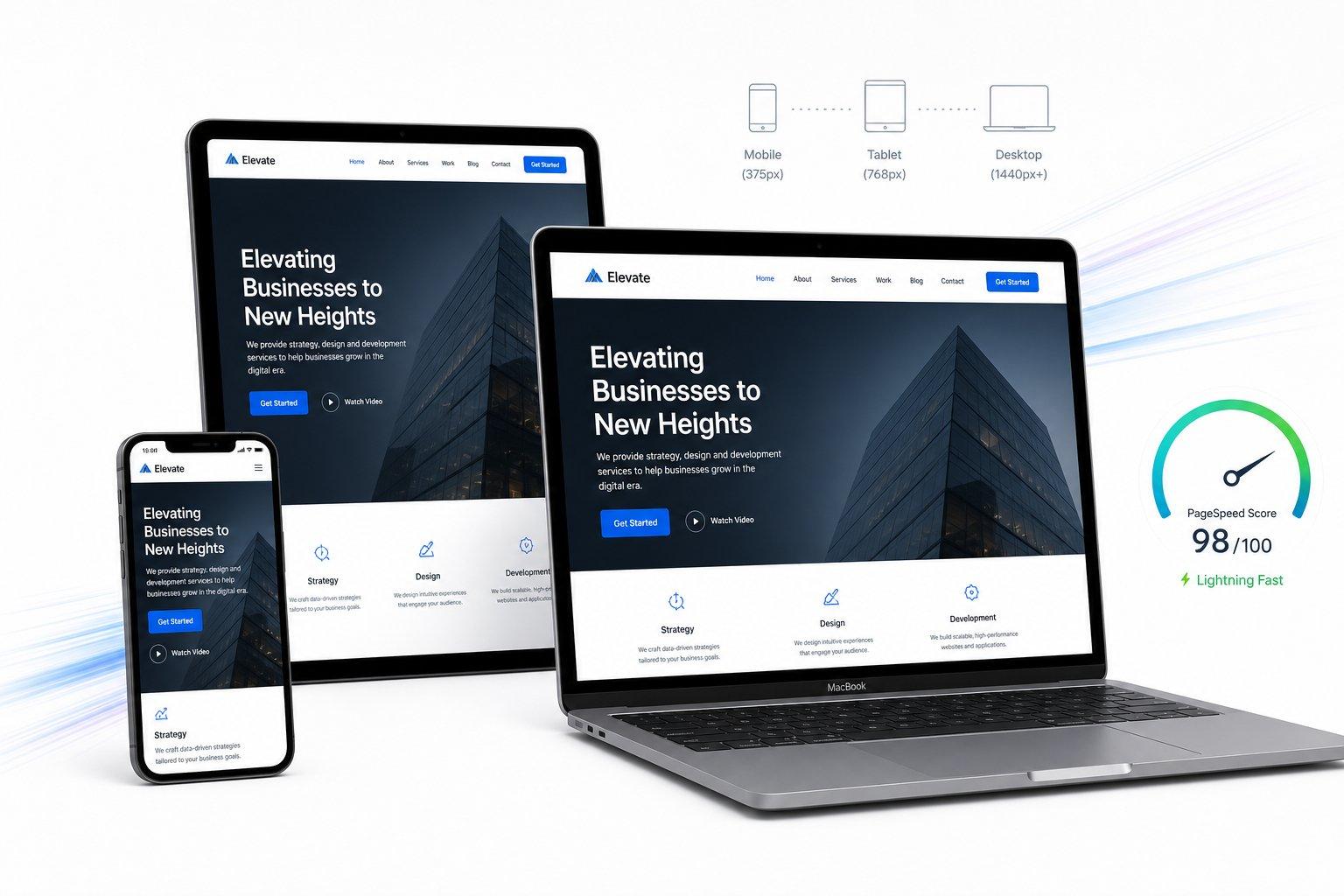
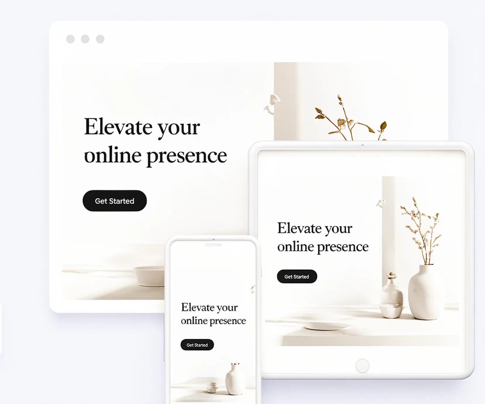
Have you been struggling to create the right buttons for your pages without fighting clunky code? Using BoltWeb when you build your website lets you design mobile-friendly website buttons and eye-catching calls to action that draw visitors' attention and help them convert. Inside BoltWeb, AI Foundry pairs with a top-notch drag-and-drop builder so you can place multiple mobile-friendly buttons wherever they belong on your layout—giving you complete control over placement while making sure phone visitors navigate comfortably.
Let's examine every detail that turns an awkward mobile tap into a confident click.
1. Why Do Visitors Miss Buttons or Tap the Wrong Thing on Mobile?
On a desktop screen, a cursor glides accurately onto a small text link or compact button without disturbing anything nearby. On a smartphone screen, a thumb covers a broad area, often while someone is walking, holding a bag, or scrolling one-handed on a bright sidewalk.
Tiny controls, crowded links, vague labels, buttons packed tightly against other interactive elements, and weak visual contrast between a button and surrounding text all cause real tapping mistakes. A visitor who means to request a quote might accidentally open a policy page or dismiss a form entirely, breaking their momentum right at the decision point. Recognizing why desktop ergonomics fail on touchscreens is the foundation of strong mobile button design, reliable mobile tap targets, and truly mobile-friendly website buttons.
2. Choose the Right Mobile Button Size for Comfortable Tapping
Rather than guessing at a single magic number for every button on your site, separate the visible box someone sees from the actual interactive tap area that registers their touch. Generous internal padding can expand the clickable hit area around a concise label, provided that invisible padding never spills over into a neighboring link or control.
| Guidance | Measurement | How to Explain It |
|---|---|---|
| WCAG 2.2 AA minimum target size | 24 × 24 CSS px | Minimum target-size criterion, subject to specified exceptions and spacing provisions. |
| WCAG 2.2 AAA enhanced target size | 44 × 44 CSS px | A larger target-size criterion for greater ease of use. |
| Practical mobile design starting point | Around 44–48 CSS px high | A useful starting point for many primary buttons, not a universal rule. |
| Button spacing | Depends on target size and context | Keep nearby interactive targets sufficiently separated to reduce accidental taps. |
Giving primary buttons comfortable vertical height and generous horizontal padding lets thumbs land cleanly without zooming in. Getting mobile button size, touch target size, and mobile tap target dimensions right removes physical friction before a visitor ever reads your form fields.
3. Leave Enough Space Between Buttons to Prevent Accidental Taps
Even a generously sized button becomes frustrating when another interactive target sits right against its border. Adjacent controls, buttons tucked right beside inline text links, tight button groups, destructive actions like "Clear" or "Cancel" placed next to "Save," and buttons hugging the very edge of a phone screen all invite accidental taps.

Example 1: Button Size and Spacing
Giving each control clean breathing room keeps a hurried thumb from triggering the wrong outcome, strengthening mobile button spacing, protecting the button touch area, and creating dependable mobile-friendly buttons.
4. Write Button Labels That Tell Visitors Exactly What Happens Next
Mobile visitors hesitate when a button forces them to guess what happens on the next screen. Generic labels like "Submit," "Click Here," or "Continue" give zero clue whether tapping starts a phone call, opens a pricing breakdown, downloads a brochure, triggers a payment, or sends a quick message.

Example 2: Button Labels
Specific, outcome-driven mobile button text and clear CTA button labels—whether phrased in direct action language or first-person phrasing—replace uncertainty with clarity through effective button wording.
5. Make Important Mobile Buttons Stand Out Without Making Every Button Look Important
When every button on a small screen uses the same bold fill color, visitors lose visual hierarchy and have to read every label carefully just to figure out the main step. Separating primary, secondary, and tertiary button styles—such as pairing a solid filled primary button with a lighter outlined secondary action or subtle text link—guides eyes straight to the core conversion action while leaving low-pressure options accessible.
Example 3: Primary and Secondary Actions
Ready to build your website?
Create your business website and get it ready to publish.
One visually dominant action, with a less prominent alternative.
Structuring mobile CTA buttons, primary button design, and mobile button hierarchy around one clear priority keeps narrow screens calm and decisive.
Place Conversion-Ready Mobile Buttons Anywhere With BoltWeb
Build Clean, Responsive Pages Without Fighting Layout Code
Stop struggling to wire up button spacing, responsive blocks, and conversion sections by hand on every page. Build with BoltWeb and AI Foundry using a top-notch drag-and-drop editor that lets you add multiple mobile-friendly buttons right where visitors decide, connect your guides cleanly, and scale your site smoothly.
Get Started On Your Journey →6. Choose Button Colors and Contrast That Make Labels Easy to Read
A pastel button with white lettering might look sleek on a studio monitor, yet turn completely unreadable when a customer checks your site outdoors in midday glare. Strong contrast between button text and background fill—guided by WCAG text contrast ratios (4.5:1 for normal text and 3:1 for large text) alongside clear non-text contrast for button boundaries—keeps controls unmistakable at a glance.
Avoid relying on hover effects that touchscreens never trigger, and never use color alone to signal success, error, or action state without accompanying text or icons. Deliberate mobile button colors, high button contrast, and accessible button design ensure every visitor can spot and read your controls effortlessly (and align closely with how you check website accessibility).
7. Place Mobile Buttons Where Visitors Naturally Expect to Find Them
Visitors tap when their confidence peaks—usually right after reading a clear value summary, comparing pricing details, reviewing service inclusions, or finishing a short contact section. Placing buttons directly beneath explanatory sections, near pricing or booking details, and inside natural contact areas keeps action within easy thumb reach.
If you use a sticky bottom CTA bar on mobile, keep it compact, anchor it cleanly near the bottom thumb zone, and make sure it never covers important text, form inputs, or cookie notices (see how to fix Cumulative Layout Shift so bars never jump unexpectedly). Smart mobile button placement, well-timed mobile call to action blocks, and clean sticky CTA button setup turn interest into action without hunting.
8. Design Button Shapes, Padding, and Typography for Touchscreens
Consistent corner radius, balanced internal padding, legible font size (16px or larger for comfortable reading without zooming), sturdy font weight, and clean line height keep buttons looking sharp across narrow screens. Full-width buttons work especially well inside mobile forms, checkout steps, and stacked card layouts, whereas compact inline buttons fit side-by-side pairs when plenty of horizontal space remains.
.mobile-button {
  display: inline-flex;
  align-items: center;
  justify-content: center;
  min-height: 48px;
  padding: 12px 20px;
  border: none;
  border-radius: 8px;
  background: #2563eb;
  color: #ffffff;
  font-size: 16px;
  font-weight: 600;
  line-height: 1.4;
  text-align: center;
  cursor: pointer;
}

.mobile-button:focus-visible {
  outline: 3px solid #111827;
  outline-offset: 3px;
}

.mobile-button:disabled {
  cursor: not-allowed;
  opacity: 0.6;
}
In this starter pattern, min-height provides a comfortable vertical target, padding gives the label breathing room while expanding the clickable area, inline-flex keeps text centered consistently, :focus-visible makes keyboard focus obvious, and :disabled shows when an action is temporarily unavailable. Always test real dimensions, colors, and states against your layout and accessibility needs so responsive button design, mobile button styling, button padding, and mobile button typography hold up on narrow viewports.
9. Show Clear Feedback When Someone Taps a Mobile Button
Without immediate feedback, a visitor who taps "Send Enquiry" on a slower cell connection often assumes the tap failed and presses the button two or three times in a row. Distinct pressed, focused, disabled, loading, success, and error states reassure people right away that their tap registered and show what is happening next.
Disabling the button during submission, showing a clear status message such as "Sending your message...", and announcing status updates accessibly prevents duplicate submissions and eases uncertainty (pair this with our guide to improve Interaction to Next Paint so controls react without lag). Thoughtful mobile button states, crisp button interaction feedback, and clear accessible button states build confidence from the first tap through confirmation.
10. Make Every Mobile Button Work with a Keyboard and Assistive Technology
Great button design goes well beyond finger taps—people also navigate mobile and desktop browsers using external keyboards, switches, voice control, and screen readers. Using a native semantic <button> element for actions (and reserving <a> links for navigation to another URL) ensures built-in keyboard activation with Enter and Space, clear roles, and proper disabled behavior (see MDN: HTML Button Element, MDN: CSS :focus-visible, and W3C: Understanding Focus Visible).
Every button also needs a clear accessible name—especially icon-only buttons—along with a high-contrast focus indicator so keyboard users never lose track of where they are. Building accessible buttons, keyboard accessible buttons, and clean semantic HTML button markup protects every visitor journey.
11. Test Mobile Website Buttons on Real Phones Before Publishing
Desktop browser previews cannot replicate how a real thumb reaches across glass while holding a phone one-handed. Before sharing a new page widely, open it on actual Android and iOS phones across different screen widths and test both portrait and landscape orientations.
Tap every primary button, menu toggle, accordion, and form submit control with your thumb to check for clipped button text, overlapping sticky bars, cramped neighboring links, or accidental taps (and follow our full guide to test mobile website performance and keep related pages linked through a smart internal linking strategy for small business). Hands-on test mobile buttons, mobile button usability, and mobile website button testing catch real-world snags before customers do.
12. Use a Mobile Button Design Checklist for Every New Website Page
Turning button checks into a quick pre-publish habit keeps small spacing or labeling slips from creeping back onto new landing pages, service pages, and blog offers. When you build and manage pages with BoltWeb, its visual drag-and-drop builder makes it straightforward to place and style mobile-friendly buttons cleanly across your layout—while deliberate review and real-phone testing ensure every button performs well before going live.
| Mobile Button Design Checklist | Status |
|---|---|
| Make important buttons large enough to tap comfortably | [ ] |
| Check the actual clickable area, not just the visible shape | [ ] |
| Leave sufficient space between nearby buttons | [ ] |
| Use labels that clearly describe the action | [ ] |
| Give the main action a distinct visual hierarchy | [ ] |
| Check text and background contrast | [ ] |
| Place buttons close to the relevant content | [ ] |
| Prevent sticky buttons from covering page content | [ ] |
| Check button text at narrow screen widths | [ ] |
| Provide visible pressed and focus states | [ ] |
| Show loading and success feedback when appropriate | [ ] |
| Use semantic button elements for actions | [ ] |
| Test keyboard navigation and screen-reader labels | [ ] |
| Try tapping buttons on actual phones | [ ] |
| Verify the complete action before publishing | [ ] |
Running through a consistent mobile button design checklist keeps your mobile-friendly website buttons sharp on the BoltWeb website builder page after page.
Give Every Thumb a Clear, Effortless Path to Say Yes
Next time someone opens your site one-handed on a busy afternoon, every button should feel roomy under their thumb, tell them honestly what happens next, and respond the instant they tap—turning casual mobile visits into real conversations without a single mis-tap in the way.
Get Started On Your Journey →FAQs: Design Mobile-Friendly Website Buttons
1. My buttons click cleanly on my laptop, so why do people miss them or tap the wrong thing on a phone?
A mouse pointer lands on a single pixel, whereas a thumb covers a wide patch of glass—often while a visitor is walking, holding a bag, or scrolling one-handed. Tiny controls, crowded links, unclear wording, or weak contrast turn an intended inquiry into a frustrated exit before the form even opens.
Paying attention to mobile-friendly website buttons, thoughtful mobile button design, and well-sized mobile tap targets stops small touch mistakes from costing you real leads.
2. How big should a button actually be on a phone so people don't struggle to tap it?
Skip arbitrary rules of thumb and distinguish the visible shape from the interactive tap area that registers a touch. Under WCAG 2.2, 24 × 24 CSS pixels serves as a minimum target-size baseline subject to exceptions and spacing rules, 44 × 44 CSS pixels provides a stronger enhanced target, and roughly 44–48 CSS pixels in height works well as a starting point for many primary buttons—with padding expanding the touch zone without bleeding into neighboring links.
Dialing in mobile button size, touch target size, and mobile tap target dimensions makes everyday taps feel effortless rather than finicky.
3. Why do visitors keep hitting the wrong button when two actions sit next to each other?
Even a roomy button gets tricky when another link or control sits right against its edge, when destructive options sit right next to primary ones, or when a button hugs a narrow screen border. Leaving clean open space between controls prevents hurried thumbs from misfiring.
Consistent mobile button spacing protects the button touch area and keeps mobile-friendly buttons accurate on crowded screens.
4. Should my button say 'Learn More,' 'Get Started,' 'Contact Us,' or something more specific?
Vague labels like "Submit," "Click Here," or "Continue" make visitors guess what happens after they tap—whether that starts a call, opens pricing, books a slot, or sends an inquiry. Specific wording like "Send My Enquiry," "View Pricing," or "Book an Appointment" tells people the exact outcome upfront so they tap with confidence.
Clear mobile button text, specific CTA button labels, and effective button wording cut hesitation right at the moment of decision.
5. How do I make my primary button stand out without turning the whole page into a sea of buttons?
When every button on a phone screen uses the same bold fill, nothing stands out and visitors have to work harder to spot the main step. Giving your primary action a clear visual anchor—while keeping secondary or tertiary choices quieter—helps people decide faster without feeling overwhelmed.
Strong mobile CTA buttons, clear primary button design, and clean mobile button hierarchy guide eyes straight to what matters most.
6. My button looks nice in a mockup, so why can some visitors barely read the label?
Soft text colors over pale fills or low-contrast borders might look stylish on a studio screen yet wash out in bright daylight or on lower-contrast displays. Pair strong text-to-background contrast (4.5:1 for normal text and 3:1 for large text under WCAG guidance) with clear button boundaries and non-color cues so labels stay readable everywhere.
Prioritizing mobile button colors, solid button contrast, and accessible button design keeps controls unmistakable (and pairs directly with how you check website accessibility).
7. Where should I put my main button on mobile so visitors don't have to hunt for it?
Put your main action right where a visitor's interest peaks—such as right after a clear value summary, beside pricing or service details, or at the end of a helpful section—rather than hiding it behind extra clicks. If you use a sticky bottom CTA on mobile, keep it compact and make sure it never covers important copy or form fields.
Thoughtful mobile button placement, well-timed mobile call to action blocks, and clean sticky CTA button behavior meet visitors at the right moment.
8. Should mobile buttons be rounded, full-width, or matched to my desktop button size?
Pick styling that fits the space and task: full-width buttons often shine inside mobile forms, stacked cards, and narrow columns, while inline buttons work well when side-by-side actions have plenty of room. Keep font size comfortable (16px or larger is a practical starting point), maintain clear padding and line height, and test how labels wrap on narrow screens.
Consistent responsive button design, clean mobile button styling, balanced button padding, and legible mobile button typography keep buttons comfortable across screen sizes.
9. How does a phone visitor know their tap actually went through instead of freezing?
Tapping a button without immediate visual feedback leaves people wondering if anything happened—leading them to tap repeatedly on a slower connection or abandon the page. Clear active, focus, disabled, loading, success, and error states reassure visitors right away and prevent accidental double submissions.
Reliable mobile button states, responsive button interaction feedback, and clear accessible button states build trust from the first tap through confirmation (and pair naturally with our guide to improve Interaction to Next Paint).
10. What if someone uses a keyboard, switch, or screen reader instead of tapping with a finger?
Use real <button> elements for actions (and <a> links for navigating to URLs), give every button a clear accessible name—especially icon buttons—and preserve a visible focus indicator so keyboard and assistive-tech users can navigate cleanly.
Sound accessible buttons, keyboard accessible buttons, and semantic HTML button markup protect every visitor regardless of input method (see MDN: HTML Button Element and W3C: Understanding Focus Visible).
11. How can I tell my buttons feel comfortable on real phones rather than just in a desktop preview?
Desktop previews cannot replicate holding a phone with one hand, reaching across a narrow screen, or rotating between portrait and landscape views. Tap through real menus, buttons, and forms on actual phones across different sizes so you catch clipped labels, crowded links, or accidental taps before publishing.
Hands-on test mobile buttons, mobile button usability, and mobile website button testing give you real proof on actual devices (and complement our guide to test mobile website performance).
12. How can I add mobile-friendly buttons easily and keep every new page consistent?
When you want a faster visual way to place mobile-friendly buttons, arrange sections cleanly, and publish responsive pages without fighting raw code, BoltWeb and AI Foundry inside BoltWeb let you build with a drag-and-drop workflow while still checking spacing, labels, and real-phone taps before launch.
Following a steady mobile button design checklist keeps mobile-friendly website buttons sharp on the BoltWeb website builder every time you publish (and connects smoothly with a focused internal linking strategy for small business).
Next time a buyer pulls up your site on a crowded commute with one hand free, every button should sit right where their thumb expects, state what happens next plainly, and turn curiosity into an easy yes.