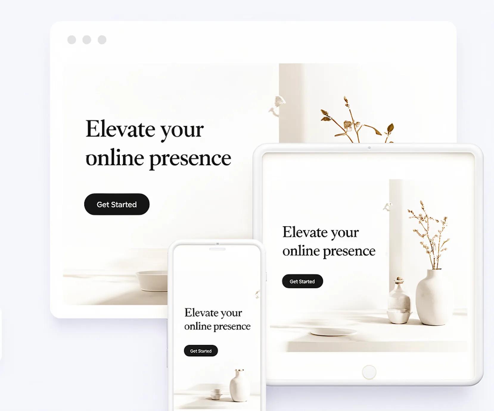
A desktop monitor gives you a massive canvas. A smartphone gives you a narrow, vertical strip roughly four inches wide. When a site designed for a 27-inch screen gets crammed onto a pocket-sized display, the entire user experience breaks. Words shrink to microscopic levels, photos get chopped off, and buttons end up so small that tapping one opens three wrong pages at once.
If visitors struggle to navigate your pages within five seconds, they will leave for a competitor whose site actually works on their phone.
Learning how to make a website mobile-friendly is not about starting from scratch or spending months coding. It is about restructuring your layout around the physical reality of how people use smartphones.

Start With Your Customer's Phone
Desktops rely on wide horizontal space where multiple columns, sidebars, and top navigation links sit comfortably side-by-side. A mobile website turns that spatial orientation upside down.
When you open a desktop-only page on a phone, the browser attempts to squeeze that horizontal layout into a fraction of the width. The result?
- Text wraps into microscopic blocks.
- Multi-column grids overlap.
- The entire page forces users to scroll left and right just to read a single sentence.
Fixing this requires shifting your design focus. Instead of planning for mouse clicks and widescreen monitors, design for thumb scrolls and narrow displays. Building a genuinely mobile-friendly website starts by respecting the device your audience holds in their hands every day.
Open Your Website on Your Phone Before You Change Anything
Before editing code or adjusting settings, you must see what your customers see. Desktop preview tools are useful, but nothing replaces an authentic mobile website test conducted on an actual handheld device.
Grab a smartphone, clear your browser cache, and run through these fundamental checks:
REAL-DEVICE MOBILE AUDIT
│
▼
[ THE DRIFT TEST ]
Does the page wobble horizontally?
[ THE THUMB TEST ]
Can your thumb reach the main action link?
[ THE READ TEST ]
Is text readable at arm's length?
- Check horizontal drift: Swipe up and down. If the page shifts left or right, an element is exceeding the viewport boundary.
- Assess thumb reach: Hold your phone with one hand. Can your thumb comfortably tap primary links without straining your grip?
- Evaluate readability: Hold the screen at a normal reading distance. Do you need to pinch-to-zoom to read product details?
Spotting these specific friction points gives you a clear checklist for effective website mobile optimization.

Make Your Homepage Easy to Understand on a Small Screen
On a desktop screen, visitors can process multiple offers, navigation bars, and background banners simultaneously. On a mobile homepage, visual clutter creates instant confusion.
When a phone user arrives on your site, they need immediate clarity. If your hero section is dominated by huge logos, slow-loading banner slides, or dense blocks of background text, visitors bounce.
A high-converting responsive homepage focuses the small screen around three core elements:
- A Direct Headline: State what you do or sell in plain language.
- A Focused Sub-headline: Explain the core benefit or problem you solve in one sentence.
- A Clear Primary CTA: Place one bold, unmistakable action button directly below the text.
Keep generous space around these elements. Clearing out unnecessary visual elements above the fold gives your message room to breathe on small screens.

Make Text Large Enough to Read Without Zooming
If your text requires manual zooming, your mobile layout is failing. Poor font choices disrupt readability and frustrate users who expect effortless browsing.
Setting up solid mobile typography means enforcing strict readability standards:
| Typographic Element | Standard Specification | Functional Purpose |
|---|---|---|
| Body Font Size | 16px minimum | Prevents manual zooming and stops auto-zoom on form fields. |
| Line Spacing | 1.5 – 1.6 ratio | Adds vertical breathing room so eyes track across lines easily. |
| Heading Sizes | 28px – 32px | Establishes a clear visual hierarchy on small viewports. |
| Color Contrast | Dark charcoal (#1F2937) on light background | Reduces harsh glare while preserving optimal legibility. |
Adopting these readable typographic standards ensures your mobile website design delivers an effortless reading experience.

Make Buttons Easy to Tap
Mice use sharp cursor points; hands use thumbs. If your action links are small or stacked tightly together, users will inevitably tap the wrong link.
[ SMALL / CRAMPED BUTTONS ]
┌────────────────────────┐
│ [Buy Now] [Learn More] │
└────────────────────────┘
──► Taps overlap constantly
[ TOUCH-FRIENDLY BUTTONS ]
┌────────────────────────┐
│ [ BUY NOW ]
├────────────────────────┤
│ [ LEARN MORE ]
└────────────────────────┘
──► Full-width, 48px height minimum
To create a truly touch-friendly website, update your click targets for finger navigation:
- Increase Target Size: Make every mobile CTA at least 48px high so it accommodates normal thumb dimensions.
- Add Buffer Space: Keep a minimum of 12px to 16px of clear space around clickable elements to prevent accidental taps.
- Span Full Width: On narrow viewports, stretch primary action buttons across the container width to make them easy to hit with either hand.

Simplify Your Navigation for Mobile Visitors
A traditional desktop menu bar packed with ten top-level items and drop-down submenus becomes unusable on a phone. It clutters the screen and blocks main content.
A clean mobile navigation setup isolates essential choices and hides the rest until requested:
- Use a Collapsible Mobile Menu: Store secondary links inside a clean hamburger icon (≡) placed in the top corner of the viewport.
- Keep Menu Items Brief: Limit your visible mobile links to the core essentials (e.g., Services, Pricing, About, Contact).
- Implement a Sticky Header: Fix a lightweight navigation bar to the top of the viewport so users can access key pages without scrolling all the way back up.
Streamlining your mobile menu keeps visitors moving smoothly through your site without getting lost.

Make Images and Videos Fit the Screen
Large, fixed-width media assets are a primary cause of broken mobile layouts. If an image is hardcoded to a fixed pixel width like 1200px, it will stretch far beyond a smartphone's edge, forcing the rest of the site out of alignment.
Properly configured responsive images adapt smoothly to any screen boundary:
- Apply Fluid Constraints: Set image elements to max-width: 100% and height: auto. This ensures media scales down naturally within its container.
- Standardize Ratios: Crop graphics into uniform aspect ratios (like 16:9 widescreen or 4:3 cards) to keep grids neat across different viewports.
- Compress File Formats: Serve images in modern web formats like WebP to maintain visual clarity while cutting file sizes significantly.
Integrating flexible visual containers into your responsive web design stops oversized media from breaking your mobile layout.

How to Make a Website Mobile-Friendly
More people visit websites from their phones than ever, so your website needs to work just as well on a small screen as it does on a desktop. A mobile-friendly website should be easy to read, simple to navigate, and quick to use without making visitors zoom, swipe around, or struggle to find what they need.
Step 1: Describe Your Website-Start by describing what your website is about in your own words. Tell BoltWeb what your business does, who you want to reach, what you offer, and what you want visitors to do. You don't need to write technical instructions—just explain your website naturally.
Step 2: Add Your Business Details-Enter your business name, email, domain, and other important information. If you already have a domain, connect it to your website. If you don't have one, you can get a domain through BoltWeb.
Step 3: Choose Your Pages-Select how many pages you want for your website. You can start with one, two, or three pages depending on what your customers need. Keeping the structure simple also makes the website easier to use on mobile screens.
Step 4: Create Your Website-Once you've entered your information, click to create your website. BoltWeb uses your description and details to build the website for you, including a layout that adapts to different screen sizes.
Step 5: Publish Your Mobile Responsive Website-Once everything looks right, publish your website and connect your domain. Your customers can then access your mobile responsive website from their phones, tablets, or computers without needing a separate mobile site.
See it in action — discover how quickly you can build a stunning website with BoltWeb.
Keep Forms Short and Easy to Complete on a Phone
Tapping out long responses on a virtual keyboard is slow and prone to errors. If your contact page asks for unnecessary details, mobile users will abandon the process entirely.
To build effective mobile-friendly forms, minimize effort at every step:
- Eliminate Non-Essential Fields: Strip away secondary questions. Stick to essential inputs: Name, Email, and Message.
- Trigger Correct Keyboards: Set form input tags correctly (such as type="email" or type="tel") so mobile devices automatically open the corresponding keyboard layout.
- Use Single-Column Inputs: Stack form fields vertically in a single line so users can tab through them logically without horizontal panning.
Streamlining your mobile contact form removes friction and boosts submission rates.

Speed Up Your Website for People on Mobile
Mobile connections fluctuate. If your site takes longer than three seconds to display content over a mobile network, a massive portion of your traffic will bounce before reading a single word.
[ SLOW LOAD RATE ]
0s ──► 2s ──► 4s ──► 6s
Blank screen waiting on heavy assets
High bounce probability
[ HIGH-SPEED LOAD ]
0s ──► 1s ──► 2s (Complete)
Instant structural layout display
High engagement rate
Optimizing website speed on mobile requires aggressive asset management:
- Minify Source Files: Remove extra spaces, developer notes, and redundant code from your CSS and JavaScript files.
- Defer Unused Scripts: Delay heavy background scripts until after the primary page content renders visually.
- Optimize Visual Assets: Compress every graphic down under 150KB to keep overall page sizes light.
Maintaining fast page loading speed protects user engagement and supports your organic search performance.

Check Every Important Page on Different Screen Sizes
Smartphones come in dozens of shapes and screen resolutions. Assuming your design functions universally because it looks right on one specific device is a risky bet.
Thorough mobile website testing requires evaluating layout behavior across key breakpoints:
- Small Displays (360px – 390px): Test tight margin spacing, single-column stacks, and headline font wrapping.
- Large Displays (414px – 430px): Check button alignments, graphic card proportions, and white space distribution.
- Tablets (768px+): Verify that single-column mobile layouts transition cleanly back into balanced multi-column grids.
Checking key service pages across multiple screen sizes helps you catch broken layout rules before your customers encounter them.

Use a Website Builder That Handles Mobile Design for You
Manually configuring CSS media queries, recalculating fluid font boundaries, and re-stacking page sections takes significant technical effort. For business owners running daily operations, managing complex codebases is inefficient.
Modern teams bypass manual coding by adopting an automated responsive website builder.
Instead of forcing you to design separate versions for desktop and mobile, an AI website builder handles underlying display parameters automatically. Containers collapse into clean vertical flows, images resize fluidly, and font hierarchies scale across devices without manual intervention.
Using an intuitive business website builder allows you to focus on your core product or service while the platform maintains layout consistency automatically.
Make Your Website Mobile-Friendly From the Start With BoltWeb
You do not need to spend weeks studying responsive coding standards or managing complex design setups just to build an authoritative online presence.
With BoltWeb, you can generate clean, lightning-fast, fully responsive business websites engineered to adapt across every display size out of the box.
BOLTWEB RESPONSIVE ENGINE
│
▼
[ AUTO-STACKING ]
Grids auto-collapse on small displays.
[ IMAGE OPTIMIZATION ]
Assets convert to WebP formats instantly.
[ LIGHTNING SPEED ]
Minimal code for fast mobile loading times.
Why businesses rely on BoltWeb to launch modern mobile sites:
- Automated Layout Adaptation: Content sections, multi-column grids, and media containers restructure automatically for small screens.
- Built-In Mobile Readability: Typography, touch targets, and spatial padding follow strict mobile usability rules out of the box.
- Native Speed & Performance: Automatic media compression and streamlined asset delivery ensure fast page load speeds on cellular networks.
- Simple Editing Experience: Update content, add pages, and adjust offers through a straightforward interface without touching CSS or code.
Stop losing potential clients to cramped layouts, unreadable fonts, and slow loading times.
Build a fast, polished, fully responsive site with BoltWeb today.

Frequently Asked Questions: Making a Website Mobile-Friendly
What does it actually mean to make a website mobile-friendly?
A mobile-friendly website automatically adapts its layout, visual assets, text scaling, and navigation paths to fit smaller viewports such as smartphones and tablets seamlessly. It ensures users can read content, view imagery, and tap action buttons effortlessly without needing to pinch, double-tap, or scroll horizontally.
Why is mobile responsiveness critical for modern search rankings?
Google relies on mobile-first indexing, meaning search engines evaluate and index the mobile version of your pages to determine rankings for both desktop and smartphone queries. If your mobile layout renders slowly, breaks formatting, or hides essential content, your domain's overall organic search visibility will suffer significantly.
What is the difference between responsive web design and a separate mobile website?
Responsive web design uses fluid CSS grids, flexible viewports, and flexible media to adapt a single codebase dynamically across any screen width. A separate mobile site (often hosted on a sub-domain like m.yourdomain.com) requires managing two distinct codebases, which increases maintenance overhead, creates potential duplicate content risks, and degrades user experience.
How big should text and buttons be on mobile viewports?
To ensure effortless readability and touch interaction without accidental taps:
- Set main body text to a minimum size of 16px to prevent browsers from automatically zooming in on form fields.
- Touch targets (such as buttons, links, and form submit boxes) should maintain a minimum tap size of 48×48 pixels with generous spacing between clickable elements.
Why is page loading speed even more important on mobile devices?
Mobile users often rely on cellular data connections (4G/5G) rather than high-speed broadband, making site weight critical. If a mobile page takes longer than 3 seconds to load, over 50% of smartphone visitors will abandon the page. Compressing images into modern formats (like WebP) and eliminating heavy code scripts are essential steps for fast mobile performance.
How do I make contact forms easy to complete on smartphones?
Minimize mobile form friction by restricting intake forms to 3 or 4 essential fields (Name, Phone, Email, Service Request). Additionally, configure proper HTML input attributes (like type="tel" or type="email") so the device automatically pulls up the appropriate numeric or email keyboard layout for the user.
What is a persistent mobile action bar and should I use one?
A persistent (or sticky) action bar is a fixed navigation strip anchored to the bottom of mobile screens as users scroll down a page. For local service trades and sales-driven businesses, featuring a persistent click-to-call button or direct booking trigger ensures prospective buyers can take immediate action at any point in their browsing session.
How can I test if my website is currently mobile-friendly?
You can evaluate your site's mobile optimization using these fast diagnostic steps:
- Open your domain on a smartphone or use Google Chrome's built-in Developer Tools (Cmd+Option+I / Ctrl+Shift+I) to simulate various smartphone viewport sizes.
- Run your page through performance testing tools like Google PageSpeed Insights to identify mobile layout shifts, uncompressed assets, or slow script execution times.
What are the most common mistakes people make when building mobile sites?
The most frequent mobile layout errors include:
- Using fixed-width elements (like wide tables or large images) that force horizontal scrolling.
- Placing clickable links too close together, leading to mis-taps.
- Relying on pop-up overlays or un-dismissable banners that cover the majority of small screens.
- Using tiny body text sizes that force users to pinch-and-zoom manually.
How can I build a fully mobile-optimized website without coding?
You don't need to write complex media queries or manually optimize code to build a responsive site. Modern visual tools like BoltWeb use native mobile-first site engines that automatically scale text, adjust layout grids, and compress media formats out of the box—ensuring your pages render quickly on any device.