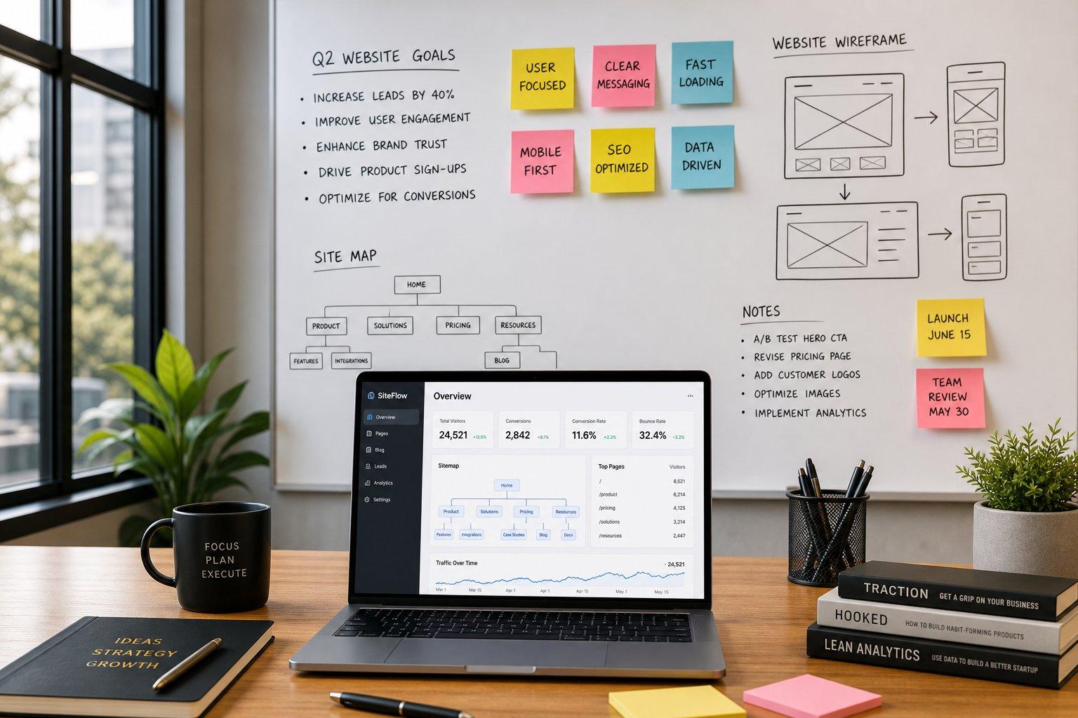
Think about the last time you walked into an unfamiliar airport.
If the overhead signage was clear, bold, and predictable, you found your gate in minutes without feeling your blood pressure rise. But if the signs used confusing terminology, pointed in contradicting directions, or vanished entirely between concourses, frustration set in instantly.
That is precisely how prospective clients feel when they explore your site.
Your website navigation is the digital signage of your brand. When you implement proven website navigation best practices, you transform a passive visitor into an engaged, high-intent buyer. When your navigation fails, potential customers leave within seconds—and they rarely come back.
Here is the complete playbook for designing, structuring, and optimizing a user-friendly website menu that feels entirely effortless.
Website Navigation Best Practices: Make It Easy to Know Where to Go
Most business owners treat their menu as a dumping ground for internal links. That is a critical mistake.
Good website navigation does not reflect how your company is organized internally; it reflects how your prospects think externally. When a first-time visitor lands on your page, their attention span is razor-thin. They aren't looking to admire your visual aesthetic—they are scanning for immediate answers to a specific problem.
By prioritizing clear orientation over decorative fluff, you reduce mental friction and establish immediate authority. Implementing strong website navigation design principles ensures that every click feels like a natural step forward.
Start With What Visitors Came to Find—Not Everything Your Business Offers
Before you begin listing links, ask yourself one crucial question: What job did my visitor hire this website to do?
Visitors don't visit your site to explore your internal organizational chart. They land on your pages to solve a pain point, review pricing, evaluate credibility, or contact a representative. When you clutter your navigation menu with non-essential corporate links, you bury the exact information your buyers are searching for.
- Primary Focus (Top Priority): Core service offerings, signature products, transparent pricing, and direct contact avenues.
- Secondary Focus (Supporting Context): About Us, case studies, client testimonials, and educational resources.
- Remove Entirely from Header: Terms of service, privacy disclosures, press releases, and internal team portals.
Focusing your website menu on buyer intent ensures your website structure serves your revenue goals first.

Keep Your Main Navigation Simple Before Adding More Pages
Here is an undeniable rule of website menu design: more choices equal fewer conversions.
The more choices you place in front of visitors, the longer it can take them to decide where to go. A header with 12 top-level links can quickly feel overwhelming, making it harder to identify the right path. Keep primary navigation focused on the most important pages and group secondary options into clear categories or dropdowns, so visitors can find their next step without unnecessary friction.
COMPLEX NAVIGATION (HIGH FRICTION)
SIMPLE NAVIGATION (LOW FRICTION)
Strive for a simple website navigation layout limited to 4 to 6 top-level destinations. Trimming unnecessary links enforces visual discipline and forces visitors to focus on your highest-converting pages.
Put the Pages People Expect to Find Where They Expect Them
Cleverness is the enemy of high conversion rates.
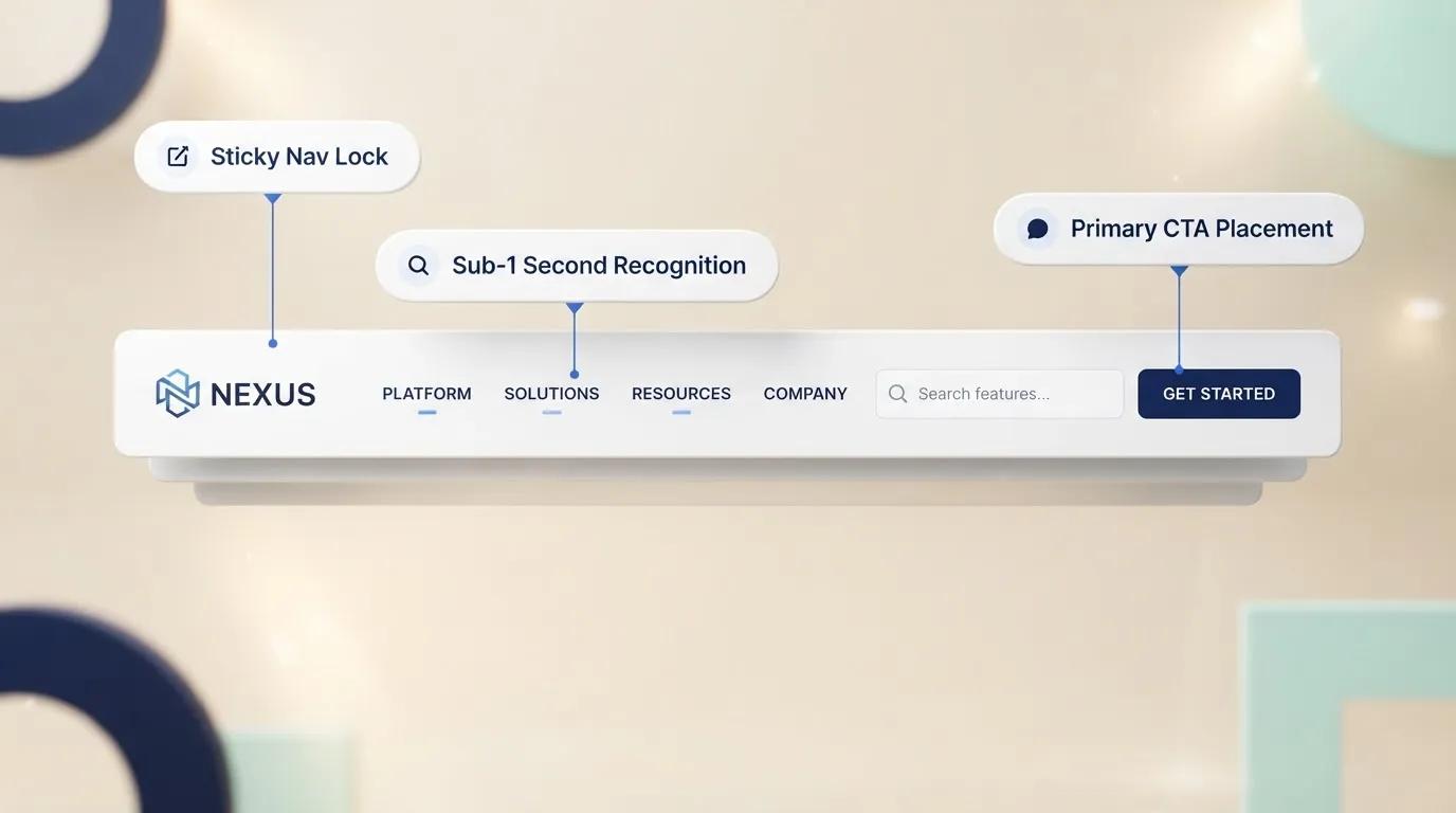
Visitors arrive with expectations shaped by the websites they already use every day. They expect familiar patterns, such as a logo in the header and a visible primary menu on desktop. When you move these elements to unexpected locations or hide essential navigation behind unfamiliar icons, visitors have to stop and figure out how your site works instead of simply using it.
- Logo Placement: Always position your logo in the top-left corner or dead center, linked directly back to your homepage.
- Contact Links: Keep your contact option on the far right of your primary header.
- Search Functionality: If you run an e-commerce platform with over 50 products, place a visible search bar prominently in the top header.
Adhering to established conventions creates an intuitive website navigation experience that instills immediate user confidence.
Group Related Pages So Your Website Feels Easy to Understand
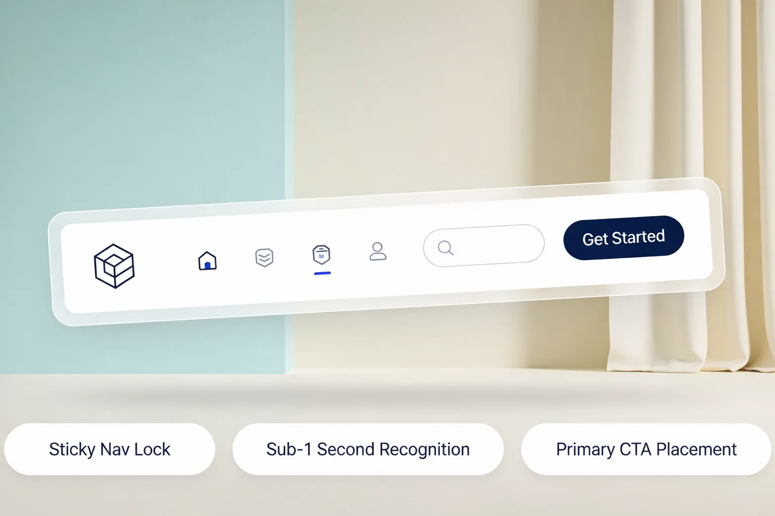
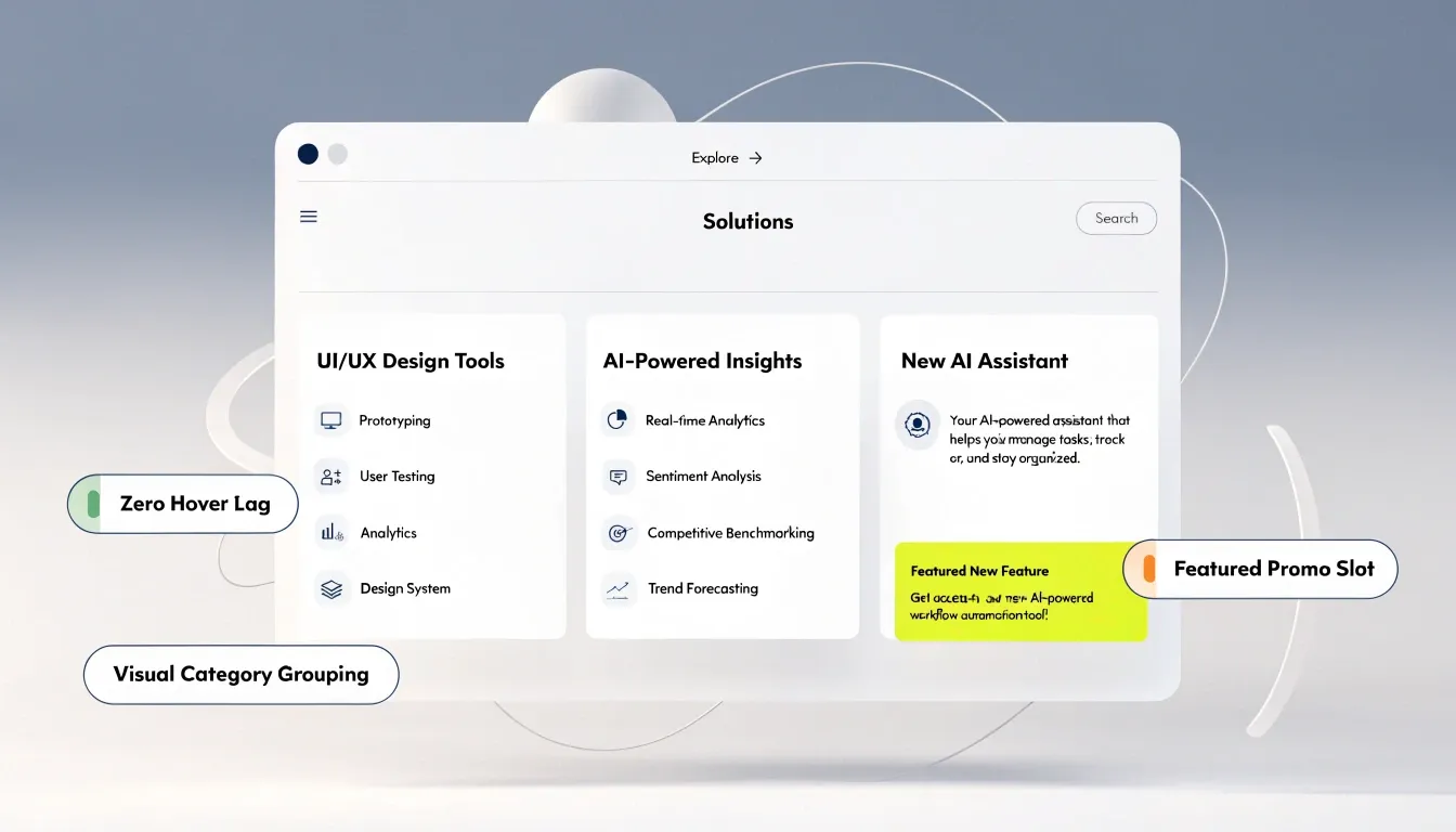
If your company offers dozens of specialized solutions, attempting to fit every service onto a flat bar destroys your layout. The solution lies in building a logical website hierarchy.
By organizing child pages under clear parent categories, you establish a clean navigation structure. Visitors scan high-level categories first and explore nested pages only when relevant to their specific search, preserving an orderly website architecture.
Use Clear Navigation Labels Instead of Clever Words
Renaming your "Services" page to "Our Craft" or your "Contact" page to "Let's Talk" might feel artistic, but it damages your website navigation UX.
When visitors encounter vague navigation labels, cognitive load spikes. They have to pause, infer, and guess what lies behind the link. In digital marketing, hesitation leads straight to exit rates.
| Vague / Clever Label | Clear / Functional Label | Why It Works |
|---|---|---|
| Our Craft | Services | Eliminates ambiguity instantly. |
| Investment | Pricing | Matches exact user search queries. |
| Knowledge Hub | Blog / Resources | Sets accurate expectations. |
| Reach Out | Contact Us | Direct, actionable, and familiar. |
Using plain, descriptive website menu labels improves website usability and helps search engine crawlers understand your site context.
Give Visitors a Clear Path From Finding Information to Taking Action
A great menu doesn't just help users browse—it actively drives conversion.
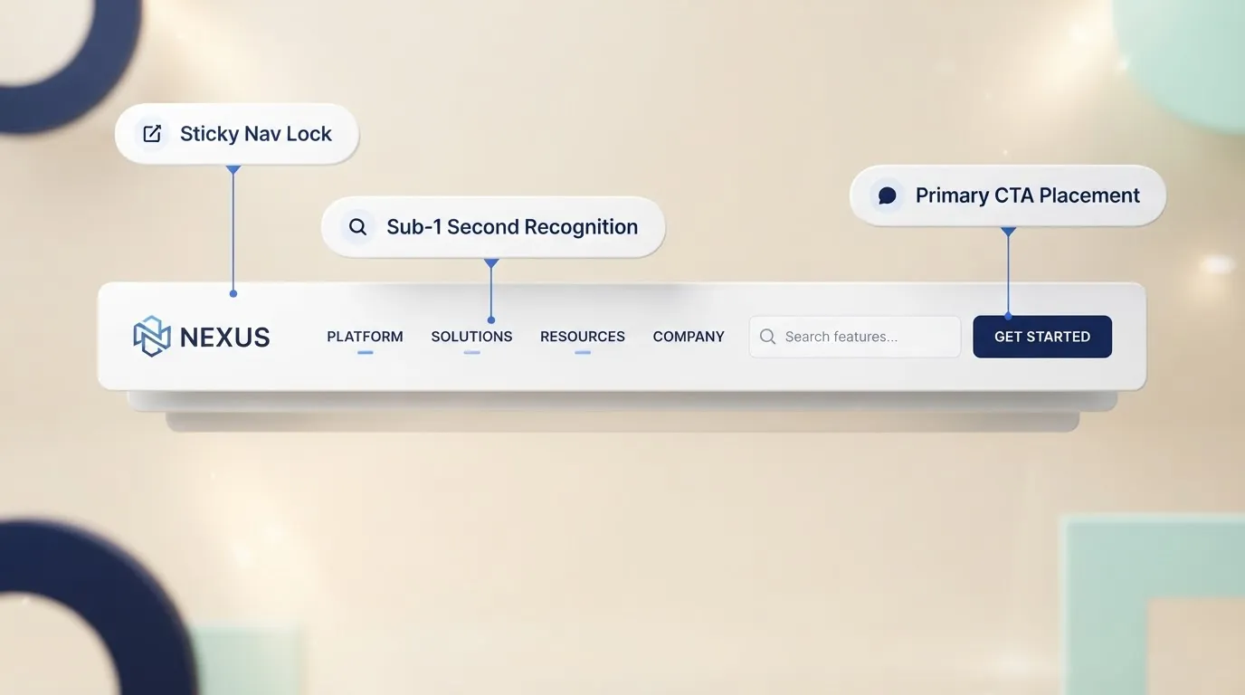
Once a visitor uses your navigation bar best practices to locate relevant details, their momentum is high. If your header lacks a distinct visual endpoint, that momentum evaporates. You must provide an obvious, high-contrast website CTA right inside the header.
- Primary Action: Style your main commercial goal (e.g., "Book a Consultation" or "Get Started") as a bold button on the far right of your menu.
- Secondary Links: Keep utility options (like "Sign In") as simple text links nearby to avoid visual conflict.
This structural hierarchy establishes a conversion-focused navigation flow that guides users effortlessly toward becoming leads.
Make Your Homepage a Starting Point, Not a Dead End
Your homepage is rarely where the final buying decision happens. Instead, it acts as a central sorting terminal designed to route different audience segments to their correct destinations.
Effective homepage navigation uses visual feature blocks to reinforce header menu items:
- Hero Section: Features a primary button directing visitors to your flagship service.
- Category Cards: Visual grid blocks that mirror your primary navigation categories.
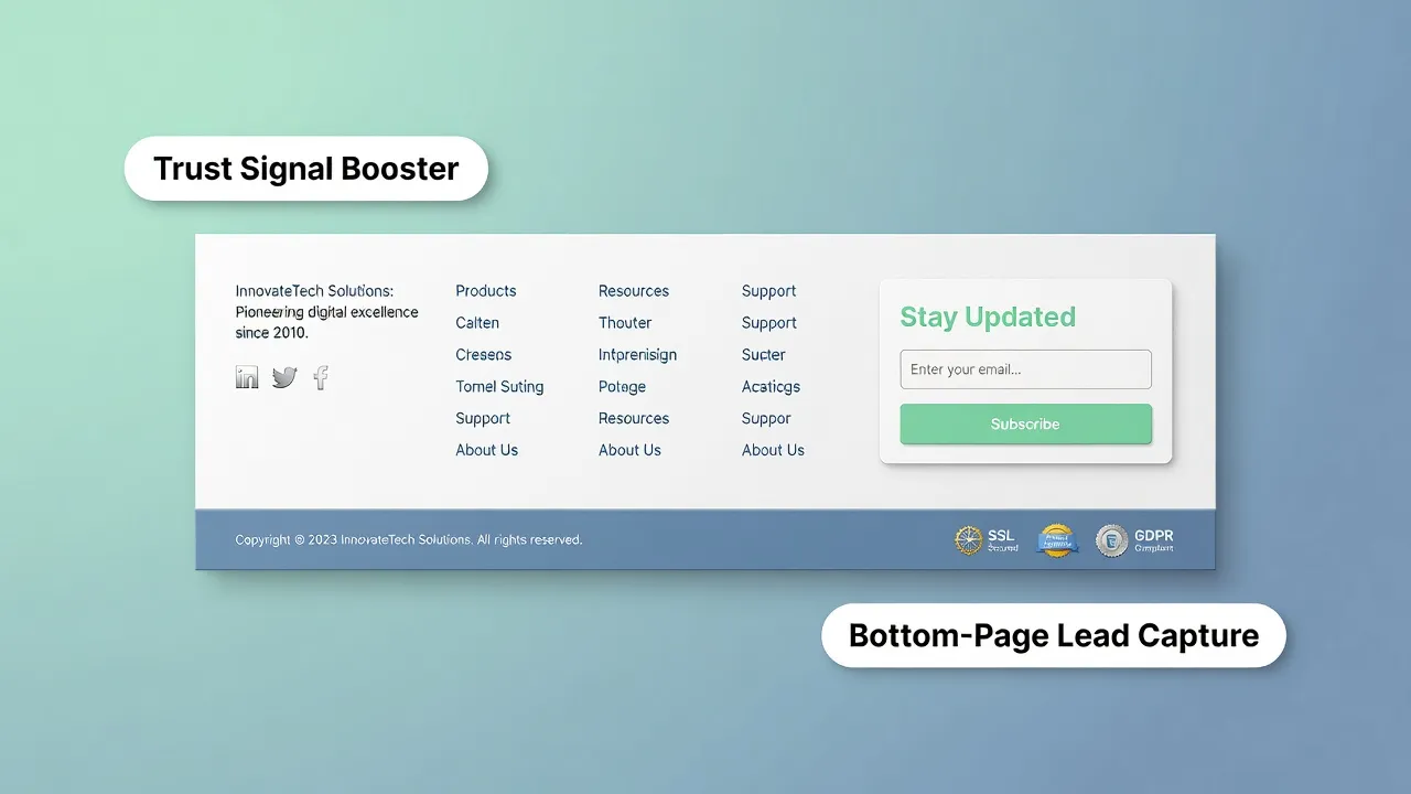
- Footer Anchors: Comprehensive links at the bottom of the page to catch users who scroll through without clicking.
Transforming your homepage into a dynamic springboard ensures visitors never hit a dead end in their user journey. Review what makes a good homepage to implement this effectively.

Use Internal Links to Help Visitors Discover More Without Getting Lost
Header menus aren't the only way people move across your site. Contextual internal linking within your body copy keeps readers engaged and distributes search engine authority throughout your website links.
When writing content, link relevant terms directly to deep sub-pages:
- When discussing pricing models, link directly to your pricing calculator.
- When mentioning past client successes, link straight to specific case study summaries.
Strategic internal links SEO builds a seamless web of content that keeps users on your domain longer while strengthening your search visibility. It's a crucial part of website navigation best practices.
Design Navigation That Works Just as Well on Mobile
Over 55% of global web traffic originates from mobile devices. If your desktop menu simply squishes down onto mobile screens, your site becomes completely unusable.
Essential mobile website navigation rules:
- Hamburger Icon (☰): Collapse secondary links behind a clean drawer menu to keep the header bar uncluttered.
- Tap Target Padding: Ensure all links and buttons have at least 44x44 pixels of touch padding to prevent accidental clicks.
- Sticky Header: Keep the top header fixed during scrolling so users can access navigation controls instantly from anywhere on the page.
Prioritizing responsive navigation ensures your business captures leads on smartphones just as effectively as on desktops.
Test Your Navigation Before Visitors Tell You It's Confusing
You are too close to your own business to evaluate your menu objectively. You already know where every page lives, which creates a cognitive blind spot.
To uncover hidden friction, conduct simple website navigation testing:
- The 5-Second Flash Test: Show your header to someone who has never seen your site for 5 seconds. Hide the screen and ask: "What does this company do, and where would you click to buy?"
- Task-Based Usability Test: Give a user a specific goal (e.g., "Find our refund policy" or "Book a demo"). Watch their cursor. If they hesitate for more than 3 seconds or click the wrong category, your labels need refining.
Regular navigation usability testing exposes structural website design mistakes before they impact your bottom line.
Improve Your Website Navigation Without Rebuilding Everything
Rearchitecting complex site menus manually used to require endless hours of custom CSS coding, dynamic dropdown scripting, and mobile breakpoint testing. If you made a single mistake in your code, your mobile responsiveness broke, or your drop-down menus overlapped critical content.
That technical friction causes far too many business owners to settle for broken, low-converting website menus.
Thankfully, you don't need a team of expensive developers to launch a world-class navigation structure.
Modern platforms like BoltWeb have completely rethought how websites are built. Operating as an intelligent AI website builder, BoltWeb analyzes your specific industry, researches visitor intent, and automatically constructs optimized header, body, and footer layouts.
- Select your industry niche inside BoltWeb
- Let the AI generate an intuitive page hierarchy & header layout
- Customize menu categories, dropdowns, and header CTAs with visual controls
- Publish a fully responsive, high-converting website in minutes
Whether you are looking for an all-in-one business website builder, a powerful small business website builder, or a specialized website navigation builder, BoltWeb handles the heavy lifting—delivering an effortless, high-converting digital presence without writing a single line of code.

Frequently Asked Questions: Website Navigation Best Practices
Why do visitors keep bouncing from my site even though my menu looks great?
Most site owners confuse visual aesthetics with functional usability. A menu might look sleek and modern, but if it forces visitors to guess where information lives, cognitive overload takes over. According to website navigation best practices, users make an instant subconscious decision within 3 seconds of landing: Is the path forward obvious? When your navigation uses clever internal jargon instead of clear, intent-driven labels, visitors stop trying to decode your site and click away to a competitor.
How many items should actually go in my primary website navigation menu?
Keep your primary navigation focused on 4 to 6 essential items. Too many choices can make visitors spend more time deciding where to go and make the header feel cluttered. If you have 10 or 12 pages, group related secondary pages into clear dropdown menus instead of displaying everything at once. This keeps the header clean, easy to scan, and centered on the actions that matter most.
Should I use creative or clever names for my menu categories to stand out?
Renaming standard pages such as “Services” to “Our Craft” or “Contact Us” to “Let’s Connect” can make your navigation harder to understand. Visitors are already familiar with labels like Services, Pricing, Support, and Contact, so they can find what they need without stopping to interpret unfamiliar wording. Clear, descriptive labels also give search engines stronger context about your site structure and the purpose of each page.
What is the single biggest mistake small businesses make with their website navigation?
The most common mistake is structuring your website menu around your company’s internal department names or operational chart rather than customer intent. Your prospects don't care how your business is organized behind the scenes; they arrive with a specific job to be done—solving a problem, checking pricing, or assessing credibility. Alignment with Voice of Customer (VoC) principles means naming your navigation items according to what users are actively searching for.
How does my website navigation structure impact search engine optimization (SEO)?
Your navigation menu serves as the primary roadmap for search engine crawlers like Google. A clean, logical website architecture with clear parent-child page relationships passes authority (link equity) effectively across your site. When critical service pages are buried deep inside multi-tiered, buried dropdown menus, search engines treat them as low-priority content, making it significantly harder to rank for high-intent target keywords.
What is the proper way to handle mobile navigation without frustrating users?
Over half of all global traffic comes from smartphones, yet desktop menus are often haphazardly shrunk down to mobile screens. A truly responsive mobile menu uses a clean accordion or collapsible drawer structure, places important touch points within easy thumb-reach, and maintains a minimum tap area of 44x44 pixels per link. Ignoring mobile navigation ergonomics guarantees a steep drop in mobile conversion rates.
Where should my phone number, address, and login links be placed in the header?
Utility items—like phone numbers, location selectors, and client portal logins—belong in a dedicated, subtle utility bar situated directly above your main navigation header. Your main navigation bar should be reserved exclusively for high-intent customer paths (Products, Services, Pricing) and conclude with a single, high-contrast Call to Action (CTA) button on the far right to guide high-intent prospects toward conversion.
How do I know if my website navigation is actually broken or confusing?
Because you already know where every page on your site lives, you are naturally blind to your menu's usability flaws. The best way to evaluate navigation performance is through task-based user testing and heatmaps. Ask someone unfamiliar with your business to find a specific service or pricing tier in under 5 seconds. If they hesitate, hover aimlessly, or click the wrong category twice, your navigation layout is quietly costing you sales every single day.
What is the difference between header navigation and footer navigation?
Your header navigation acts as the main steering wheel, keeping visitors focused strictly on primary conversion paths. Your website footer, on the other hand, acts as a safety net for deep researchers and analytical buyers. When visitors scroll all the way to the bottom without converting, your footer should catch them with secondary details: legal policies, full site maps, physical addresses, trust seals, and direct support links.